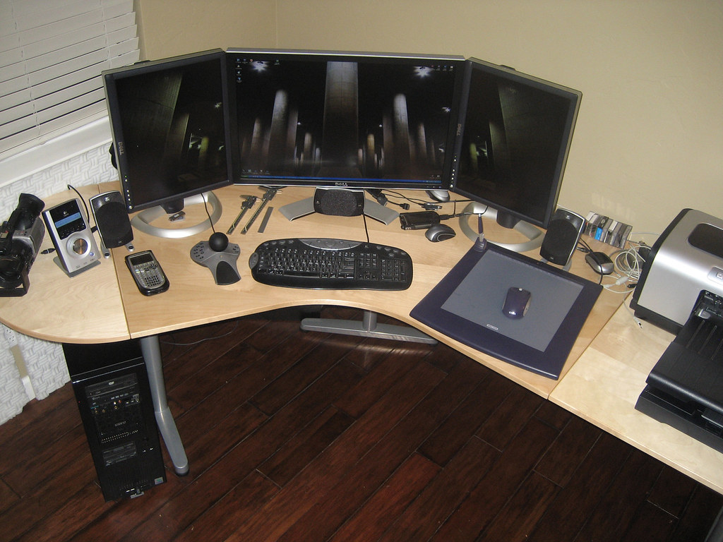
Post Your Desktop "Background screenshot"

This doesn't cover what Gutsy supports because it's still in testing: https://help.ubuntu.com/community/HardwareSupportComponentsWirelessNetworkCardsLinksys

If your card is listed as working then great, if it's listed as not working or isn't listed, then still give Gutsy a try as it might now work.

If it's a USB one then scroll down here: https://help.ubuntu.com/community/WifiDocs/WirelessCardsSupported

Also, check the Ubuntu forum - http://ubuntuforums.org

Thanks! Mine is the first on the list. :) Once I get my Hard Drive I'll download it.
 
That's good news then :)

In the meantime I'd recommend you spend some time on the Ubuntu forum looking around, read what people have problems with in case you come across them. Always helps if you know the solution beforehand to anything that may crop up.

Here's the one specific to Gutsy testing - http://ubuntuforums.org/forumdisplay.php?f=238

Personally I'm not having any issues at all with Gutsy, everything works as it should and it's rock solid.
 
Last edited:
That's good news then :)

In the meantime I'd recommend you spend some time on the Ubuntu forum looking around, read what people have problems with in case you come across them. Always helps if you know the solution beforehand to anything that may crop up.

Here's the one specific to Gutsy testing - http://ubuntuforums.org/forumdisplay.php?f=238

Personally I'm not having any issues at all with Gutsy, everything works as it should and it's rock solid.

Actually, I'm already a member of the Ubuntu forums. Thanks for the help!


~Jordan
 
Here's mine: (Click Here)

1261781542_429e5ebc6f_b.jpg
 
lol too bad he put that type on there in that horrible papyrus font and made it look like a 3rd grader did it in paintshop pro.
 
lol too bad he put that type on there in that horrible papyrus font and made it look like a 3rd grader did it in paintshop pro.

So what does it matter if it "looks bad"? Its a beautiful piece. No matter how the format is.


EDIT:

I like the font anyways :P
 
obviously you don't know pro, because pro would never EVER use papyrus.

i don't know, use something like helvetica or garamond.
 
obviously you don't know pro, because pro would never EVER use papyrus.

i don't know, use something like helvetica or garamond.

It would obviously look better if I put some depth to it. Hmm...a good OS X picture editor that is free.
 
what do you mean depth? you just need to pick a solid typeface, not one that was created to look cool for microsoft word on flyers :)

generally any time you ever see that typeface it was not done with someone with design background, basically an amateur. i'm not taking any shots or anything just trying to mature your taste haha
 
Back
Top