You are using an out of date browser. It may not display this or other websites correctly.
You should upgrade or use an alternative browser.
You should upgrade or use an alternative browser.
Post Your Desktop "Background screenshot"
- Thread starter [KoG]^wEaZel
- Start date
DrCuddles
New Member
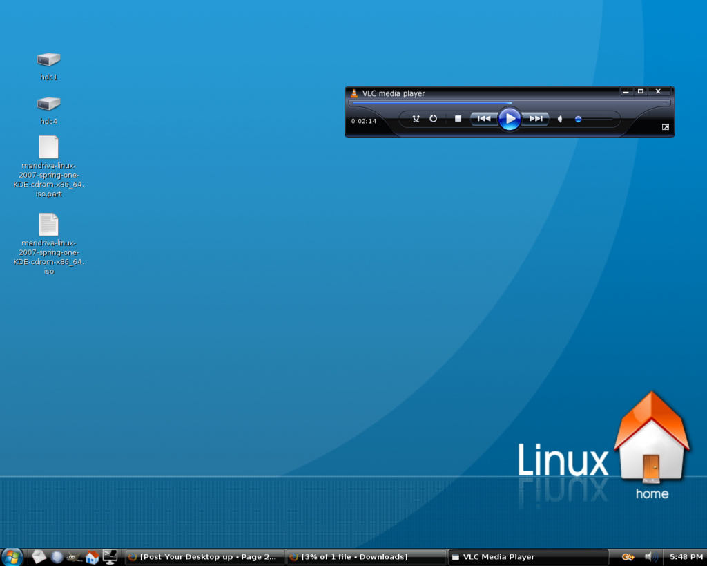
Hmmmmm, its too dark for my liking, and i dont like the icons, they're not very anit-aliased, too pixely.
Im not a big fan of your back ground either, lol you posted this just to annoy me didnt you?!?!?
monoman
New Member
Hmmmmm, its too dark for my liking, and i dont like the icons, they're not very anit-aliased, too pixely.
Im not a big fan of your back ground either, lol you posted this just to annoy me didnt you?!?!?
It's dark because I set the background brightness slider down to dark.
The icons look fine on my screen, maybe some quality was lost in the screenshot. Did you view it full size or just what size your browser reduced it to?
This is the normal colouring of the background:
http://www.kde-look.org/CONTENT/content-files/37891-morning.jpg
Last edited:
DrCuddles
New Member
It's dark because I set the background brightness slider down to dark.
The icons look fine on my screen, maybe some quality was lost in the screenshot. Did you view it full size or just what size your browser reduced it to?
This is the normal colouring of the background:
http://www.kde-look.org/CONTENT/content-files/37891-morning.jpg
fair enough, sorry i didnt resize the image in my browser
Irishwhistle
New Member
After nicking Simon's background:

That desktop really needs some serious personalization. Here is may latest Ubuntu 7.04 Gnome desktop:

~Jordan
Dreamlinux looks awesome mate.
il have to try it out
Ben
VIP Member
That's my desktop, I spend looking at it a few seconds every day, no need for fancy wallpapers.

Ahhhh! How could you not change your wallpaper? It's so ugly. Yuck
I have over 519 wallpapers and counting(I'm downloading some right now
tlarkin
VIP Member
at my office several computers have the dunder mifflen wall paper, it is plain but then again we think the office rules!
I won't post a direct copy of the pic because I am too lazy to rehost it and I don't wana leach bandwidth but here is a link
http://static.flickr.com/22/91083880_0c1bc7be44_o.jpg
I won't post a direct copy of the pic because I am too lazy to rehost it and I don't wana leach bandwidth but here is a link
http://static.flickr.com/22/91083880_0c1bc7be44_o.jpg
Dreamlinux looks awesome mate.
il have to try it out
It uses XFCE which I've never used before so it takes some getting used to, but I'm finding that I'm liking it.
Never really been one for docks but engage is nice and very quick, even runnng in a live session. In fact, this is the fastest live session I have ever tried!
I'm doing a complete upgrade on my pc today and decided I wanted to try another disto instead of putting openSUSE back on it, hence why I'm trying DreamLinux
That desktop really needs some serious personalization. Here is may latest Ubuntu 7.04 Gnome desktop:

~Jordan
Why copy the Vista style start menu?
monoman
New Member
where did you get taht
just image search for 'neuron art', or something like that, it was the winning picture in a science/art competition i found on teh net, using real data about neurons to produce the CGI.
Ben
VIP Member
at my office several computers have the dunder mifflen wall paper, it is plain but then again we think the office rules!
I won't post a direct copy of the pic because I am too lazy to rehost it and I don't wana leach bandwidth but here is a link
http://static.flickr.com/22/91083880_0c1bc7be44_o.jpg
Haha, that's a great idea! The Office rocks!


